Commerce Use Cases: Catalogs, Payments, Carousels, and CTAs
Online commerce has changed how people discover, evaluate, and buy products. Today, customers expect smooth browsing, instant pricing, and easy checkout—often within the same platform. According to the U.S. Census Bureau, eCommerce now accounts for over 15% of total retail sales, and that share keeps growing each year. Meanwhile, studies from Baymard Institute show that nearly 70% of online carts are abandoned, often due to poor user experience or friction during checkout.
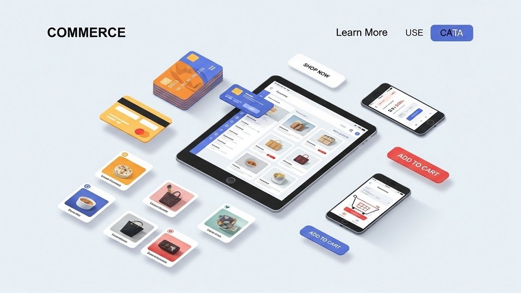
This is where modern commerce use cases come in. Features like product catalogs, in-chat payments, visual carousels, and clear calls-to-action (CTAs) help businesses guide users from interest to purchase. In this article, you’ll learn how these components work, why they matter, and how to apply them effectively in real-world commerce scenarios.
Understanding the Basics
Commerce use cases describe how businesses use digital tools to present products, accept payments, and encourage action. Instead of sending customers through multiple steps, these tools reduce friction by keeping everything simple and connected.
For example, a customer browsing a product catalog can tap a carousel image, see pricing instantly, and complete payment without leaving the page. This seamless flow improves trust, speed, and conversion rates.
Why This Topic Matters
Modern buyers value convenience more than ever. When commerce experiences feel complicated, users leave.
Key benefits include:
-
Faster buying decisions with fewer steps
-
Higher conversion rates and lower cart abandonment
-
Better customer experience across mobile and desktop
Real-world impact:
A small online store using in-app catalogs and instant CTAs can compete with much larger brands simply by offering a smoother buying journey.
How users apply it:
Businesses embed catalogs, payments, and CTAs directly into websites, apps, and messaging platforms to shorten the path from interest to purchase.
Scenario:
A customer sees a product on social media, taps “View Products,” scrolls through a carousel, clicks “Buy Now,” and completes payment in under a minute—no redirects, no confusion.

Key Components / Features / Steps
Component 1: Product Catalogs
A product catalog is a structured list of products with names, images, prices, and descriptions. It acts as a digital storefront.
Good catalogs are:
-
Well-organized by category
-
Easy to search or filter
-
Updated in real time
Compared to static product pages, dynamic catalogs allow customers to explore options quickly without feeling overwhelmed.
Component 2: Payments
Integrated payments allow customers to complete purchases instantly. This could be through cards, wallets, or local payment methods.
Actionable tips:
-
Reduce the number of required fields
-
Offer familiar payment options
-
Clearly show price breakdowns
The easier it is to pay, the more likely customers will finish the transaction.
Component 3: Carousels and CTAs
Carousels showcase multiple products or offers in a swipe-friendly format. CTAs guide users on what to do next—such as “Buy Now,” “View Details,” or “Add to Cart.”
Common mistakes to avoid:
-
Too many slides in one carousel
-
Vague CTAs like “Click Here”
-
Missing price or value cues
A strong carousel paired with a clear CTA keeps users engaged and focused.
Practical Tips You Can Apply Today
-
Step one: Audit your current product flow and remove unnecessary steps
-
Step two: Add visual carousels for best-selling or featured products
-
Step three: Use one clear CTA per screen or section
Keep the tone simple, the design clean, and the action obvious.
Common Mistakes and How to Avoid Them
Mistake 1: Overloading users with choices
Too many products at once can cause decision fatigue.
Quick fix: Highlight bestsellers first.
Mistake 2: Hidden or unclear CTAs
If users don’t know what to do next, they won’t act.
Quick fix: Use bold, action-oriented CTA text.
Mistake 3: Complicated payment flow
Extra steps increase abandonment.
Quick fix: Enable one-page or in-context checkout.
Real Example or Mini Case Study
A mid-sized fashion retailer added product carousels and in-chat payments to their online store. Previously, customers had to browse products, open new pages, and go through a long checkout process.
After simplifying the flow—catalog → carousel → CTA → payment—the brand saw faster purchase decisions and fewer abandoned carts. Customers reported that buying felt “quick and effortless,” which increased repeat purchases.
Final Thoughts
Commerce use cases like catalogs, payments, carousels, and CTAs aren’t just features—they shape the entire buying experience. When implemented correctly, they reduce friction, build trust, and drive more conversions.
If you want better results from your digital commerce efforts, start by simplifying how customers browse, decide, and pay. Small improvements in flow can lead to big gains in sales. Now is the time to audit your setup and optimize for ease, clarity, and action.
FAQs
What is a commerce use case?
A commerce use case explains how businesses apply digital tools to sell products more efficiently.
Why are product catalogs important?
They help customers browse and compare products quickly in an organized way.
How do carousels improve conversions?
They visually highlight multiple products while keeping users engaged and focused.
What makes a strong CTA?
Clear, action-driven language like “Buy Now” or “View Products.”
How do integrated payments help businesses?
They reduce checkout friction and lower cart abandonment rates.
References
-
U.S. Census Bureau – eCommerce Retail Sales Reports
https://www.census.gov/retail/index.html -
Baymard Institute – Cart Abandonment Statistics
https://baymard.com/lists/cart-abandonment-rate -
OECD – Digital Economy Outlook
https://www.oecd.org/digital/ -
Federal Reserve – Consumer Payment Choice Studies
https://www.federalreserve.gov/paymentsystems.htm
Related Topics: 15 No-Spend Month Rules to Transform Your Financial Habits
Related Topics: Corporate Recycling Programs That Generate Revenue